|
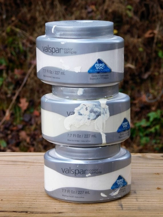
We do a lot of interior painting in Asheville, but this week I'm taking a break for the holiday and painting my own space... 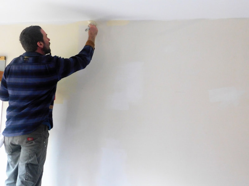 ...which means that my wife and I have been looking at colors all week. With many years of painting experience, I've come up with a few tricks for choosing the right colors for a room, and I thought I'd share them today. Consider the Mood It's tempting to paint a room your "favorite color", but sometimes that may clash with the mood of the room. For example, I love red walls as much as the next person, but they might not be ideal if you want a restful mood. Before we painted our walls, my wife collected photos of rooms she liked: 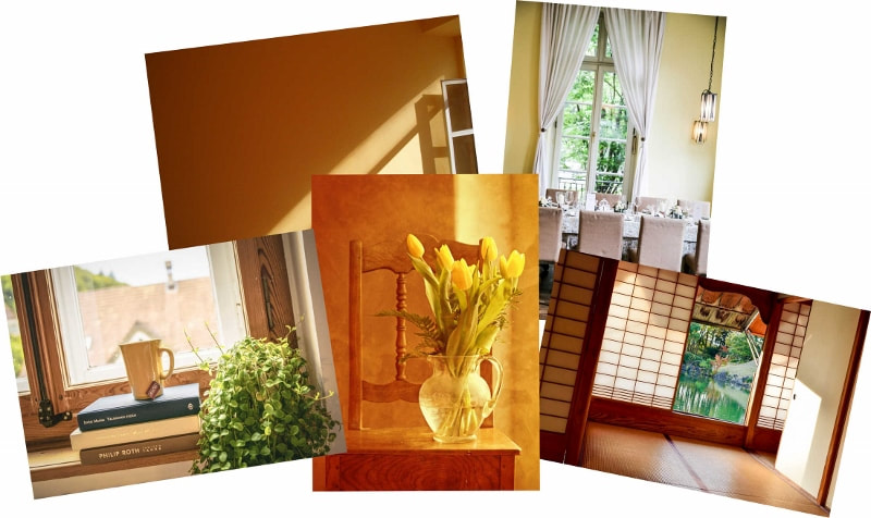 She decided that what they had in common was a "warm glow," so we got lots of paint chips in warm colors. And speaking of paint chips... Get LOTS of Chips... but Don't Stop There Paint chips are free, so get all the ones you think you want, and then get 30 more. Once you've narrowed it down, get some sample paint jars and roll out a big area of each color you like. We started with 3 colors that all looked the same in their little jars but were REALLY different when we rolled them out on the wall. Some looked golden yellow, while others looked icy white.
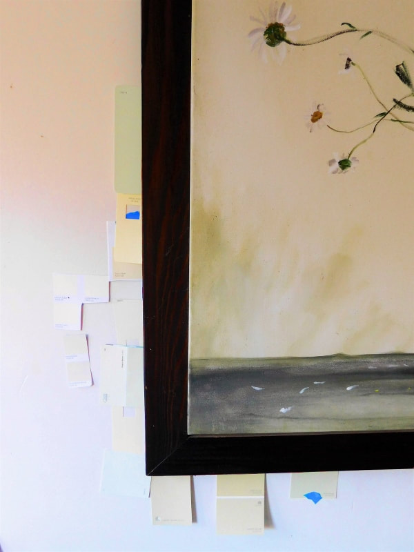
(In fact, I thought about calling this post "Fifty Shades of Beige!") Consider Your Art and Furniture It's tempting to choose a paint color in isolation, but remember that you'll have furniture and maybe some art in your home, too! Use your collection as a starting point. Put swatches of color near your couch, your favorite paintings and so on. 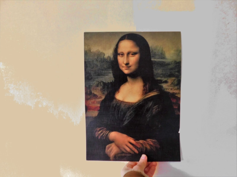 The Mona Lisa prefers the warm glow. Context is everything with color; and it's not just the furniture that you have to consider. Look at the Color at Different Times of Day My wife's first choice looked like pistachio green in the evening... 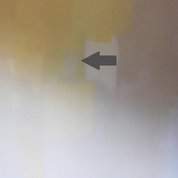 ...but in the morning sunshine, it turned into electric lime green! Which brings me to my next point: Go Gray Really brilliant colors like cobalt blue look best in small spots, like on a table lamp. When you're painting a large wall, it's better to choose a color that's a little bit grayer or "muddier." I saw a great example of this in another job I did recently. Instead of matching the brilliant blue in this painting, my customer chose a grayer color. In fact, it looked plain gray in the can, and the "blue" didn't come out until I spread it out on the wall. 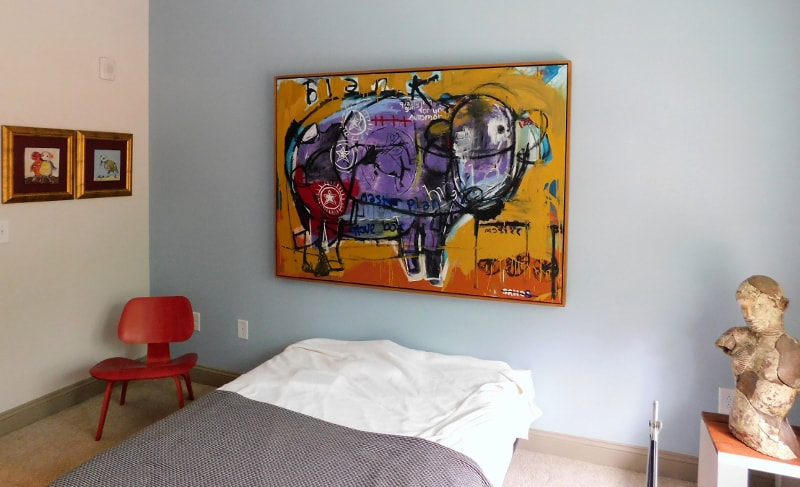 When we painted our walls, we ended up using a much duller color than we expected, but it still has the warm glow that we were looking for.  Once you've chosen your color, it's time to choose an interior painter with practice.
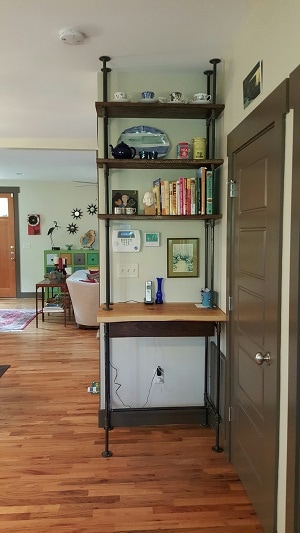
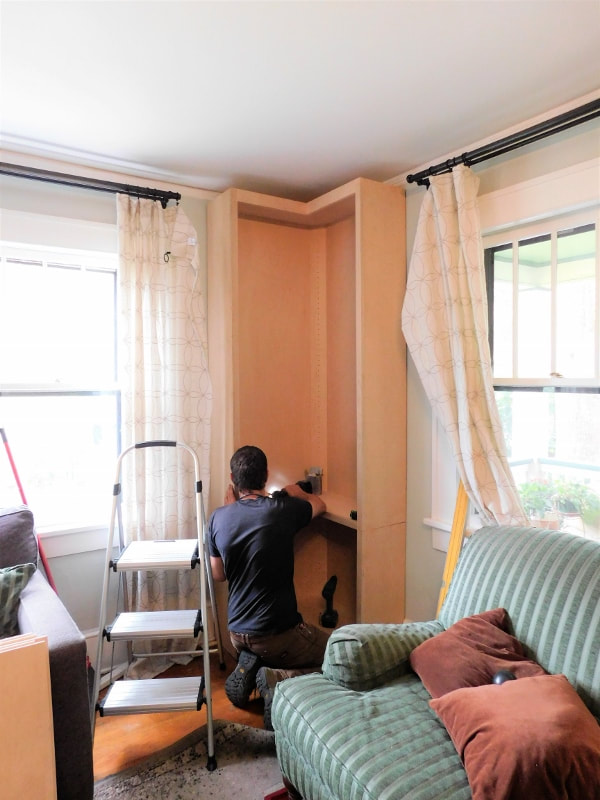
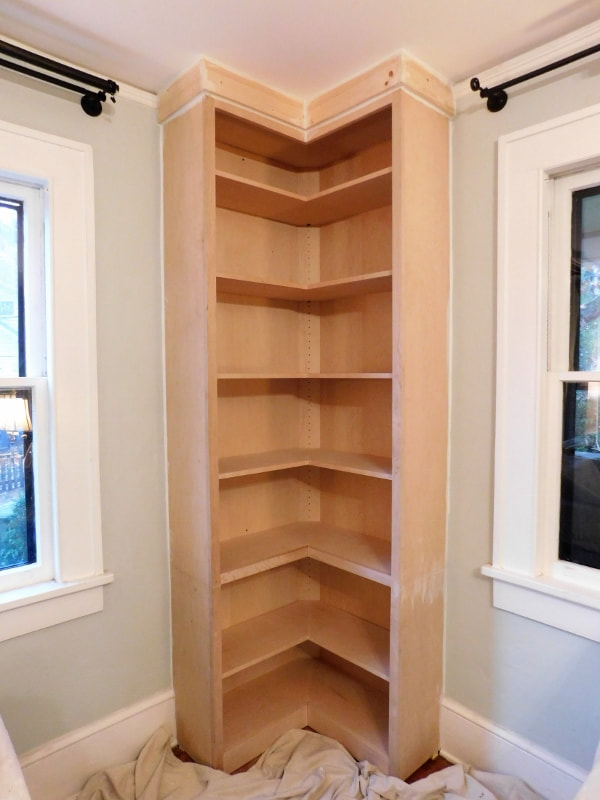
One of my customers recently presented a challenge to me: install a set of pre-made, custom-ordered book shelves that were nearly as tall as her ceilings. Why was this a challenge? 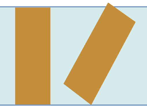 The shelves were too tall to bring through the doorways while standing upright, so they had to be brought in sideways and tipped into place. Unfortunately, they were too tall to tip into place without cutting a hole in the ceiling. We solved the problem by cutting the shelves in half. I hated to do it, but luckily I'm good with a saw, so it was a clean cut that could easily be patched.  We prepared the area by cutting out the baseboards so that the shelves could stand snugly against the wall, then we set the pieces of the unit in place. We had cut the book case right below one of its shelves, so most of the line was invisible as soon as the shelf was replaced.
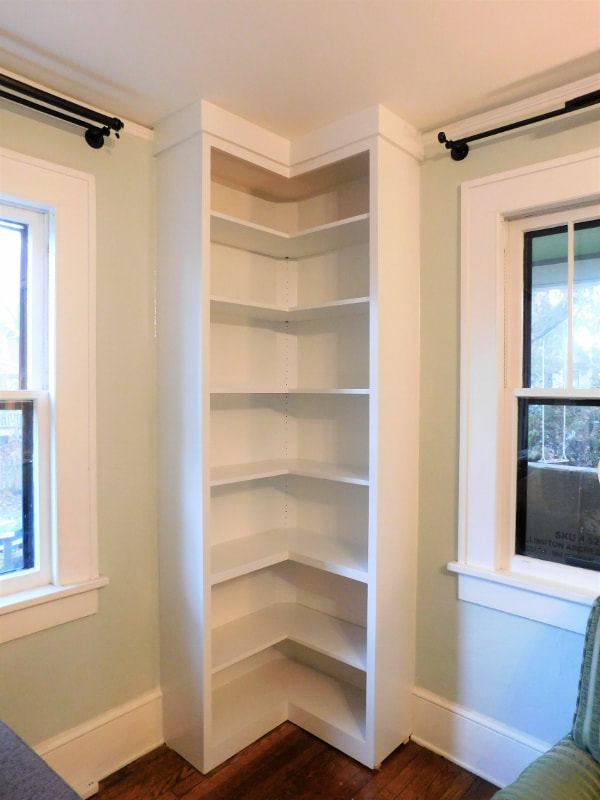
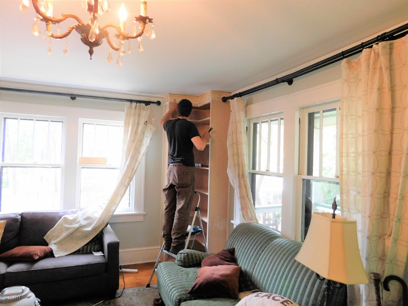 We added crown mold for a finishing touch, and then we caulked the gaps and painted the whole unit to match the existing trim.
It looks like it's always been there!
If you come across a carpentry conundrum in the Asheville area, give us a call! One of my customers recently returned from a trip to Spain and Portugal with a suitcase full of hand-painted tiles. Wow, what a souvenir! 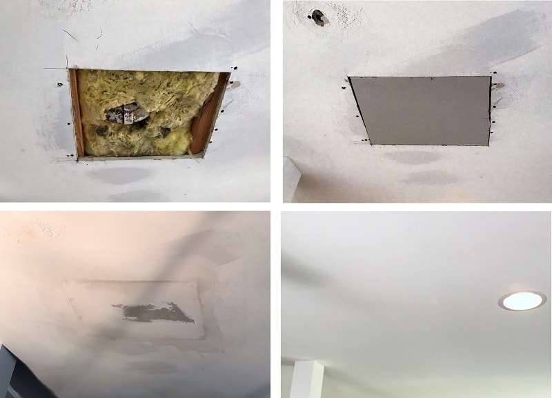 It took her awhile to decide what to do with them. Her kitchen doesn't lend itself to a tiled backsplash, and even her kitchen island already has a nice marble top. But after some thought, she came up with a place for them: the side of the island.  If I had been deciding how to lay these out, I might have spent all day dithering over the right placement, but she confidently spread them out on the floor with barely a moment's hesitation. I like the way she left a bold symmetrical tile in the middle.  Notice that there are no grout lines! That's the great thing about using tiles in purely decorative places, where no water will splash on them: you can just butt them together. The close placement really sets off the "patchwork" effect. They look great with the colorful art in the rest of the kitchen. 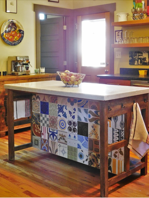 Speaking of colorful art, we had some tiles left over, so we put them in the dining room near her red wall. I love this idea. It's durable, washable art.
If you need someone to install tiles in your Asheville kitchen or bathroom, give us a call. Whether it's fancy hand-painted porcelain or simple gel tiles, we'll be glad to help you make your home beautiful.
|
About

Welcome to my blog! This is a chronicle of the adventures of Arthur Teel, a handyman working in Asheville and Weaverville, NC. Need someone to fix your home?
Connect!
Archives
April 2022
This blog is for entertainment purposes only. See our Terms of Use for details.
|


The current turn-around time for our interior painting team is 2 weeks.
Our handyman team is currently fully scheduled and not taking new projects.
What Our Clients Are Saying
"Arthur is that rare professional handyman who is totally reliable; fairly priced; pro-active in communications; honest; punctual; skilled -- and a really nice guy." "Arthur is a great resource to have here in our area. He's prompt, professional, does great work and is cost effective. I'll definitely use him again!" |
Follow Us:Email US AT:Service Area:
In-town Asheville
Mars Hill and Weaverville Arden and Fletcher Fairview Popular Services |
|